Speed
TRITAPT distinguishes four types of speed,
which vary in the times that are used in the calculation. All types
of speeds are computed by dividing distance by time.
- Operational speed: the time that elapsed between observed departure
times at the stops involved. At the last stop of the route the
observed arrival time is used.
- Passing speed: the time used in operational speed, minus the time
that elapsed while waiting at stops.
- Company speed: the time used in operational speed, minus any delays
that occurred between stops.
- running speed: the time used in passing speed, minus any delays that
occurred between stops.
Clearly, operational speed is the lowest and running speed is the highest
of these four types.
In the graph, the horizontal axis shows two-letter abbreviations for the
halts along the route. The vertical axis shows speed in km/h.
Between each pair of halts there are two red arrows and a gray bar
separated in two by a small white line. The red arrows indicate the
lowest and highest observed speed. The bar indicates the 15% and the
85% values of the speed; thus 70% of the observed speeds was between
the top and the bottom value of the bar. The white line in the bar
indicates the mean observed value.
On the right of the graph, the average values over the entire route
are shown.
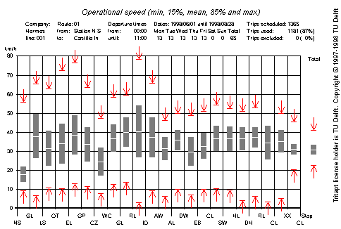
The highest observed speeds are quite miraculous. The explanation for
these values is that the on-board computers do not always register the
time that a vehicle came to a stop or started moving again. When the
engine of the bus was switched off, sometimes truely erratic values
are recorded. In the 1191 trips used for this graph, there were
obviously a few errors in the recorded times. See the
Trip matching page for a list of
problems and potential causes in AVL and board computer data.
The mean values and the 70% interval are much more reliable. From the
graph it is clear that the operational speed between the first two
stops is very low (on average about 17 km/h). The average speed over
the entire route is quite good (about 31 km/h). The low average speed
between the first two stops is caused by delays
between those stops.
It is to be expected that the width of the speed probability distribution
is much smaller over the entire route than over individual route sections.
In fact, the width of the speed probability distribution is inversely
proportional to the length of the route (section).
TRITAPT can also produce a speed graph that shows all observed speeds.
In this graph the individual speeds are indicated with fine horizontal
green lines. The 1191 trips used for this graph causes many of the
green lines to touch, resulting in bigger green areas.
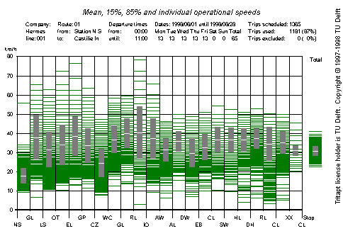
From this graph, one can get an impression of the probability distribution
of the speeds that occurr on this route. The data in this graph can also
be shown in a tabular format. In this table one can easily locate trips
with exceptionally high or low speed.